New Haven, CT Architecture, art and advisory firm Svigals+Partners has completed an expansion to the headquarters of Achillion Pharmaceuticals, Inc. The firm designed the new offices, the latest project in an ongoing partnership with Achillion that has included several office renovations and research laboratory designs. The results provided a template for the design firm’s client to reconsider and revamp its approach to workplace culture company-wide.
Achillion’s leadership approached Svigals+Partners with the project already recognizing that the approach to the design would need to be bold and creative. The expansion would be in the ground floor of 300 George St., an address at which the biopharmaceutical company already occupies space on the 2nd and 8th floors. Achillion’s leadership recognized that employees may be resistant to the idea of working in ground floor space, so their solution was to ask the designers make sure that the new space would be “awesome.”
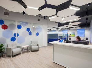
The result is a space that has the admiration of the company’s employees: an office with high ceilings, crisp lighting, welcoming ‘huddle areas’ with writeable walls, and brand-oriented integrated art.
“Initially, Achillion’s leadership was not sure which department would occupy the expansion,” said Svigals+Partners’ Dan Dryzgula, Assoc. AIA, “only that it would need offices, workstations and conference rooms. So we started with a neutral but informed approach to programming.” The design team delivered a plan for the 5,536 s/f that included a break room with a kitchen in addition to eight private offices, two conference rooms, two huddle areas, and space for roughly a dozen workstations.
The designers next set about delivering on the promise of something awesome, a familiar challenge for a firm whose stated mission is to work with clients to create productive playgrounds–environments of open participation and creative play that support innovation, inspiration and productivity.
The design team began by taking advantage of the basement’s 12-foot-high ceilings to create a dynamic, undulating ceiling of hexagon-shaped acoustic panels suspended in the open workstation area. Integrating the hexagon, one of Achillion’s two corporate symbols, inspired by the molecular structure of DNA nucleotides, connects the company’s branding across multiple floors, and enhances one of its core values.
Incorporating glass doors and transoms into the interior walls, the architects brought daylight from the limited number of below-grade windows into as much of the office plan as possible. The rest of the lighting was supplemented with LED fixtures. The cost effective LED lighting bars are cohesively woven into the custom hexagon ceiling system, located at various points where the panels meet. “The panels and fixtures appear to float,” said Dryzgula. “The effect is bright, fun and energetic.”
As an additional playful element to further enhance the branding, the team specified a custom suspended LED fixture in a hexagonal configuration over the breakroom-kitchen area. That space, along with the two conference rooms, also feature a custom art installation composed of wall-mounted fabric-wrapped panels: the fabric bears simple fields of grey and white that are divided by an angle inspired by the tilt of Achilles’ spear in the company’s logo.
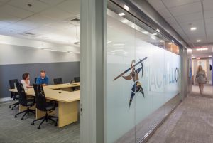
The main entry and conference room glass walls proudly bear the inspirational Achilles logo, company name and tagline “Research Realized.” The same striking angle of the spear can be noticed immediately upon entry on the main branding wall, and also appears in the floor pattern and kitchen tile design.
Taking the productive playgrounds idea even further, the designers looked for opportunities to foster inspiration and informal collaboration. This approach led to the inclusion of art walls in several areas. Designers applied a coat of writeable/erasable whiteboard paint to the surfaces of walls in the huddle areas: one just outside the breakroom and another near a workstation cluster in the open office. For an added bold use of color, the latter writeable wall is a bright blue instead of white, anchoring it to the center of the office areas. The floor-to-ceiling whiteboards provide a utility and interactivity that supports breakout meetings and other types of informal, creative activity, including play.


