
News:
Owners Developers & Managers
Posted: July 9, 2015
Acentech receives Society for Marketing Professional Services Boston Award for branding/visual identity
Acentech, a nationally recognized multi-disciplinary acoustics, audiovisual, IT and security system design, and vibration consulting firm, was honored with two awards from the Society for Marketing Professional Services (SMPS) Boston 2015 Communications Awards program. Acentech received the first place honor in the Branding Experience/Identity category and the People's Choice award for its animated holiday piece, "Acentech's Thanksgiving Cornucopia." The Branding Experience/Identity category recognizes a company's new or updated brand experience that could include the roll-out of a new logo, graphic standards, and/or visual and content update of materials, applied firm-wide or for a specific market. In awarding the first place honor, the jury found Acentech's new brand to be "contemporary and fresh," the "soundwaves included in the logo are compelling and graphically elegant," and "tying the past and the future together was evident in the brand." Local fine arts painter and graphic designer Julie Beck created the logo design with collaborative, creative input from Acentech staff.
"Acentech's rebranding represented an opportunity to create a new unified visual identity for the first time in nearly a quarter century - one worthy of the company's talented staff and sterling reputation," said Sarah McGillicuddy, director of marketing and business development at Acentech. "Our goal was to create a clean, sophisticated, and well-designed graphic identity and consistent supporting marketing collateral that the entire company could stand behind. Both the graphic element and logotype are the result of a true collaboration between the firm's marketing and technical staff. We are gratified to be honored by our peers for this significant re-branding endeavor."
First Place: Branding Experience/Identity
In early 2014, Acentech was ready to overhaul its visual identity, which had not changed in nearly 25 years. Due to a lack of graphic standards, the colors, font sizes, and logos on digital and paper materials were inconsistent, and their marketing materials appeared dated. Acentech sought to create a new visual identity of which the entire company could be proud, as well as reimagine all marketing materials and establish precise branding guidelines company-wide.
Acentech's new logo consists of one unified font, two clearly established colors, and a graphic element depicting intersecting sound waves - an abstract homage to Acentech's consulting work. The graphic element was designed in a cool blue tone to maintain a thread from the original branding color scheme, and the lettering for the word Acentech was designed using Helvetica - the same font used in the bold "A" of the original logo.
Acentech's new graphic identity extends to a full office suite of materials, marketing collateral, tradeshow banners, and promotional items, and all graphics exhibit a consistent and unified use of composition, color, and type. Challenges such as a limited budget, a tight timeline, and the internal resistance to change were overcome by involving staff from the very beginning of the process and at all critical stages. The results are fresh new materials that Acentech's consultants use with pride, a successful launch to clients, and an increased digital marketing presence with expanded design opportunities.
People's Choice Award: Animated Holiday Piece, "Acentech's Thanksgiving Cornucopia"
Following this successful rebranding effort, Acentech innovated a two-pronged Thanksgiving-themed holiday appreciation campaign. The first element was a creative Thanksgiving-themed video animation that incorporated Acentech's new visual identity and expressed thanks to Acentech clients in a festive and playful way. Serving as a platform to unveil Acentech's new visual identity, every part of the turkey and video animation was created with shapes based on Acentech's new logo. Acentech's animated holiday piece may be viewed at https://vimeo.com/112205045.
The second element was targeted at Acentech's clients in the form of a cookie gift basket with thank you card for all members of the respective client firms to enjoy. While this effort also reinforced Acentech's new visual identity, more importantly Acentech was able to express appreciation for its clients' patronage, reaching more than 4,600 people in 60 firms while staying well below budget. Acentech's video animation and cookie gift baskets were strategically sent in November to tie into Acentech's message of giving thanks to its clients with the theme of Thanksgiving.
MORE FROM Owners Developers & Managers
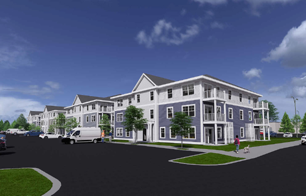
M&R Development presents newest housing project, 172-unit Windham Village
Windham ME M&R Development, the multidisciplinary development company behind The Downs in Scarborough, today announces its newest housing project, Windham Village. Located in-town on Tandberg Trail, the 172 units are a combination of 1 and 2- bedroom apartments and condominiums that are for sale and lease.


Quick Hits
 (1).png)

Columns and Thought Leadership

Retail infill strategy to activate Pawtucket’s Conant Thread District - by Gaetan Kashala
Until recently, the Conant Thread District consisted of approximately 150 acres of underutilized industrial land spanning Pawtucket and Central Falls. Today, the area is one of the most significant

Florida ruling raises bar for condo terminations and buyouts - by Michael Karsch
On October 14, 2025, in a landmark decision with significant implications for the Florida real estate market, the Supreme Court of Florida formally denied Two Roads Development’s (TRD Biscayne LLC) petition for review in its long-running case against unit owners of Biscayne 21,

IREM president’s message: Our new reality - Staying ahead of supply chain delays - by Yoany Vargas
Supply chain delays are slowing construction, ratcheting up operating costs, and extending turnover timelines across Greater Boston, directly reducing revenue and increasing the workload for multifamily and

Revitalized Town Centers: Retail??? - by Carol Todreas
It is now widely accepted that customers want to shop in person at physical stores. Brands know that they do better business in a physical store than just on line so they want to open stores. Demand for retail space by digital merchants, local entrepreneurs, and newly developed national chains
 (1).png)