 (1).png)
News:
Owners Developers & Managers
Posted: June 8, 2018
Visualizing Massachusetts property values with data - by Corey Woods

Data has become a big industry. But for the most part, data alone can’t tell you anything monumental. It’s not until someone like Arron Doucett, a geospatial analyst, takes that data and puts it to work.
One of Doucett’s latest projects is a map of Massachusetts. The map color codes properties by value. Each color is a specific range of property value. This data had been around for quite some time, Doucett just gives us a unique way to graphically interpret it. The visually stunning map shows us 2.5 million data points.

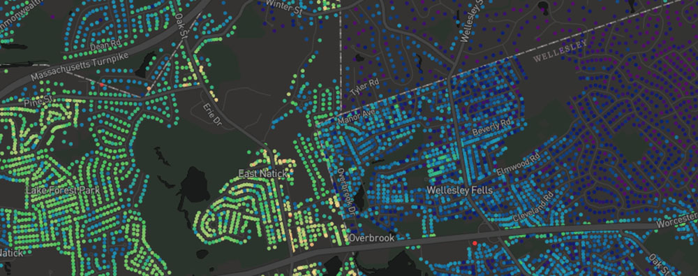
The data for these property values comes from the town assessor in which they determine the taxes on the property as opposed to the market value, which is usually a little higher. The map is interesting to study. It includes an overlay of the MBTA lines. They connect the more densely populated areas with lower property values to Boston.Then as you get closer to Boston values change color and become higher. It also perfectly illustrates how town borders can make the difference in property values almost to where you can see the shape of the town just based on the data points. You can find an updated 2.0 version of the map here.
Corey Woods, webmaster for New England Real Estate Journal, Norwell, Mass.
MORE FROM Owners Developers & Managers
Crescent Village Shopping Center trades to new owner for $1.75 million
Monroe, CT Crescent Village Shopping Center located at 115 Main St. has been sold to new owners. The multi-building retail center sold for $1.75 million or just under $142.00 per ft. The three buildings total 12,340 s/f on 1.54 acres


 (1).png)

Columns and Thought Leadership

Retail infill strategy to activate Pawtucket’s Conant Thread District - by Gaetan Kashala
Until recently, the Conant Thread District consisted of approximately 150 acres of underutilized industrial land spanning Pawtucket and Central Falls. Today, the area is one of the most significant

IREM president’s message: Our new reality - Staying ahead of supply chain delays - by Yoany Vargas
Supply chain delays are slowing construction, ratcheting up operating costs, and extending turnover timelines across Greater Boston, directly reducing revenue and increasing the workload for multifamily and

Florida ruling raises bar for condo terminations and buyouts - by Michael Karsch
On October 14, 2025, in a landmark decision with significant implications for the Florida real estate market, the Supreme Court of Florida formally denied Two Roads Development’s (TRD Biscayne LLC) petition for review in its long-running case against unit owners of Biscayne 21,

Revitalized Town Centers: Retail??? - by Carol Todreas
It is now widely accepted that customers want to shop in person at physical stores. Brands know that they do better business in a physical store than just on line so they want to open stores. Demand for retail space by digital merchants, local entrepreneurs, and newly developed national chains